2017 Guy Carpenter Brand Refresh: The visual evolution
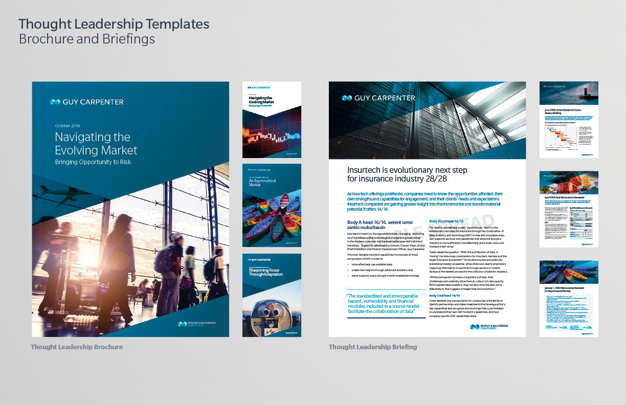
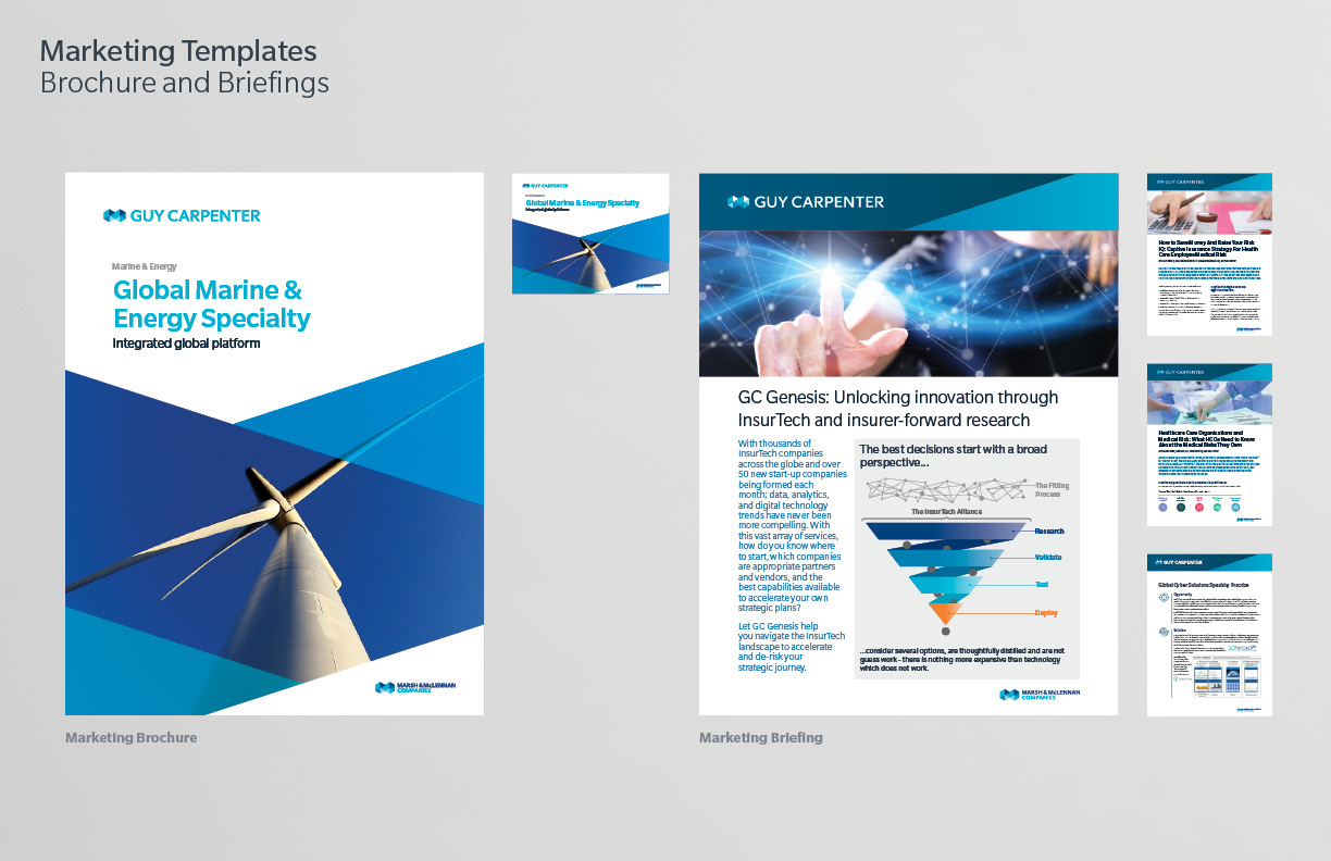
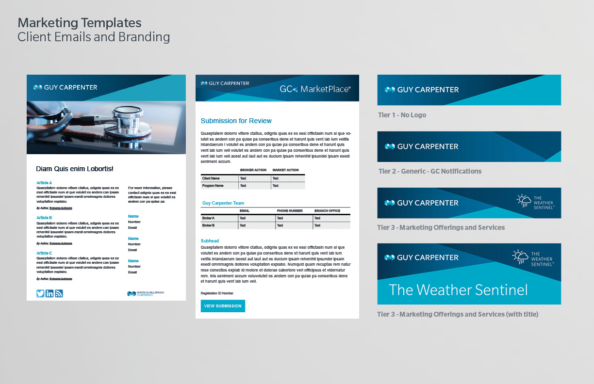
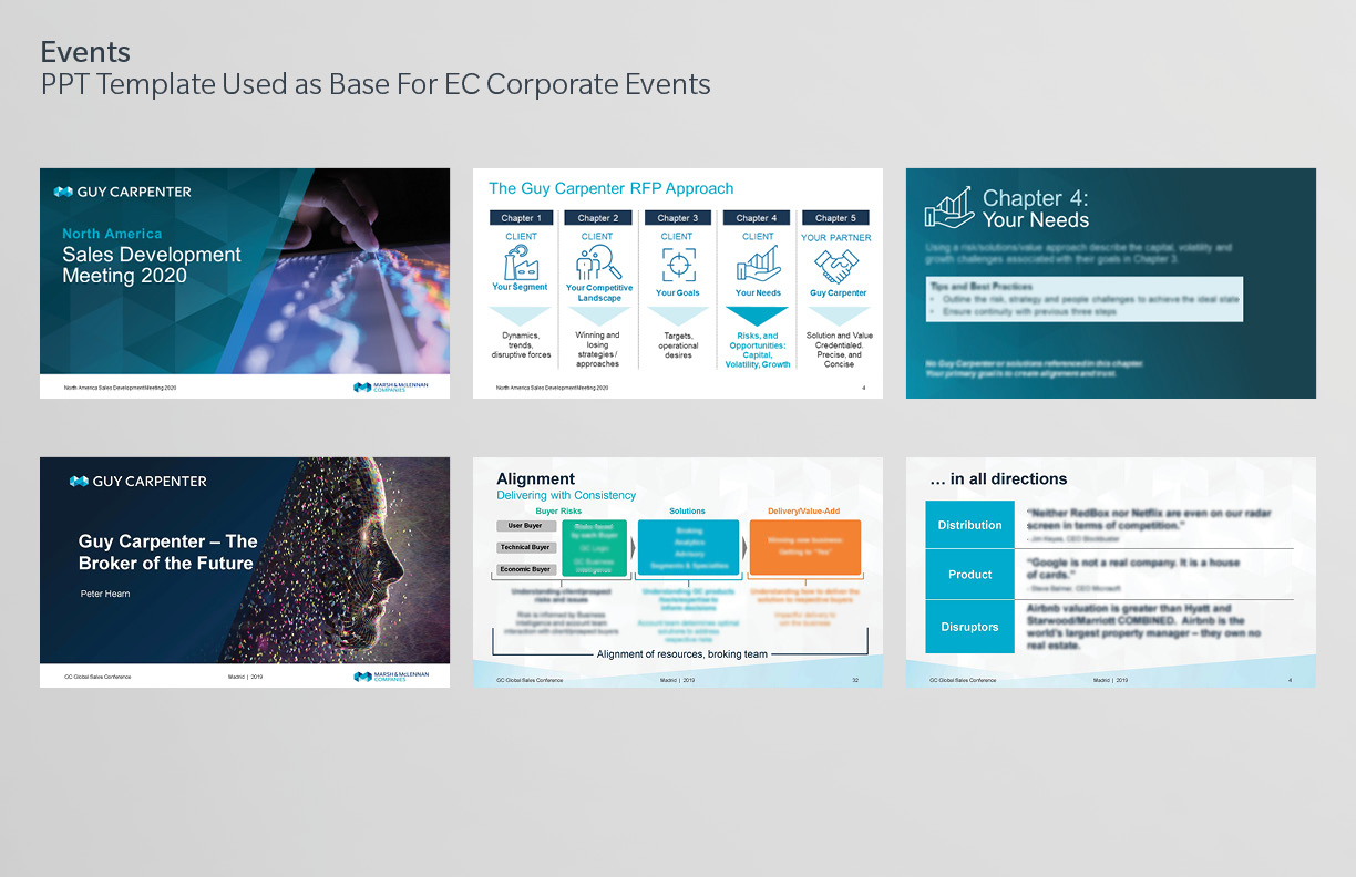
Guy Carpenter’s visual identity system comprises of a shared family of logotypes, typefaces, color spectrum’s and graphic elements known as facets. Using these core elements and the shapes within the “M” symbol, the visual brand has evolved to represent innovation and forward momentum.
These are attributes that trace back to the founding of Guy Carpenter and are deeply rooted in our DNA. Guy Carpenter’s visual refresh, introduces new templates for thought leadership, marketing collateral, event signage and interactive graphics. It will maximize the impact of our client-facing material and create a distinct visual presence, leading Guy Carpenter into the future.